Printable Sentiments for Card Making: How to Match a Sentiment to Any Card Background
There is a little moment in card making that I think most of us know. The card is almost finished, the papers are layered, everything seems to be coming together — and now you just need a sentiment.
You place one on the card... and somehow, it doesn't look right. The sentiment itself is lovely. The card background is lovely. But together? Not so much.
For a long time, I thought the problem was that I was choosing the wrong font, or that the sentiment was too big or too small. But after trying lots of different sentiments on different cards, I've realized that the words and the font are usually not the problem. It mostly comes down to contrast and where the sentiment sits.
So I made three cards to show you what I mean: one with a very busy patterned background, one with a soft pastel pattern, and one with a large block of solid color. For each card, I tried several different printable sentiments before choosing the one I liked best.
And that's something I want to emphasize: there isn't always one objectively "right" sentiment. Sometimes you just need to try a few until you find the one that makes the whole card feel right.


The Two Things I Look for When Choosing a Sentiment
I don't think there are strict rules in card making, but there are two things I almost always check when a sentiment doesn't seem to work.
First, can I see it clearly?
There needs to be enough contrast between the sentiment and everything around it.
Second, does it have a clear place to sit?
If you put a sentiment directly onto a busy pattern, it can get lost even when the lettering itself is beautiful. A plain panel, strip, or solid color block gives it a little breathing room. And that's really it.
You don't necessarily need a simpler font. You don't need to make the sentiment tiny. You don't have to avoid a decorative script just because your background is already busy. You just need to give the sentiment a visual home.
I actually changed my mind about this while making the first card below. I used to think that a large decorative script was the wrong choice for a busy background. Surely the background was already doing enough? But when I tried it, I loved the result. The secret wasn't the font. It was the solid color block behind it.
Let's look at the three cards.
Card 1: A Busy Pattern Background
This was the card that changed my mind about using a large decorative script on a busy background. The patterned paper is full of flowers, leaves and little details in several colors. I love it, but there isn't really a quiet area anywhere on the card.


The teal block gives the lettering a clean background, so the script can be as decorative as it likes without getting lost in the flowers. The cream panel underneath creates another layer of calm between the sentiment and the busy pattern.
I also like that the teal is already present in the patterned paper. It's a small detail, but borrowing a color from the background is one of my favorite ways to make a sentiment feel as though it belongs on the card.
This was a good reminder for me that a busy background doesn't mean you need a simple sentiment. Sometimes you can use the most decorative sentiment of all — you just need to give it a solid shape to sit on. And if you don't have a decorative punch or die for the panel, that's absolutely fine. A simple rectangle will do the same important job.
Looking at the card without a sentiment, you can see that the background already has a lot going on. That isn't necessarily a problem — the pattern is supposed to be the star here — but it means the sentiment needs to be given enough space and contrast to become part of the design rather than simply another detail competing with everything else.
I tried several different sentiments to see what would happen.


I liked how "Shine Bright" and "Love You Always" looked on the card, but the one I finally chose was a large, flowing "Good Luck" sentiment printed in white on a solid teal block.


Card 2: A Soft Pastel Background
The second card has almost the opposite problem. The background is soft and delicate, with pale pinks, tiny flowers and little watering cans. It's a very gentle pattern, so a pale sentiment can easily disappear into it.


The difference is quite small in terms of what I've actually added, but it changes the balance of the whole card. The dark sentiment gives the eye somewhere to stop, while the white panel around it keeps it from sitting directly on top of the floral pattern.
I also like that the charcoal connects with the dark gray card base. That repeated color helps the different layers feel like one design rather than a collection of separate pieces.
This is the opposite of Card 1. There, the patterned paper was strong and colorful, so I used a color from the pattern for the sentiment. Here, the background is pale, so I went much darker.
The important thing isn't whether the sentiment is light or dark. It's the amount of contrast between the sentiment and its surroundings.


Without a sentiment, the card has a very soft, low-contrast look. That's lovely, but it also means that the sentiment needs to provide a little more visual weight.
So I tried several options again.
This time, the darker options immediately had more presence. I finally chose the "Enjoy The Moment" sentiment in white script on a dark charcoal block.


Card 3: A Solid Color Background
The third card is a little more forgiving because the sentiment already has a large area of solid color behind it. The blue floral paper is framed with white, and the large dark green panel gives the sentiment a quiet place to sit.
Against the dark green, the white sentiment is immediately noticeable. And the little pink flower adds just a touch of color without competing with the floral paper.
This card is doing almost the exact reverse of the second one. Card 2 needed a dark sentiment against a pale background. Here, a light sentiment against a dark background works beautifully.
Again, there isn't one formula for choosing a sentiment. Look at what your card already has, and then decide what the sentiment needs to add.


The one I liked best was "In Full Bloom and Thinking of You", with black lettering, a white background and a little pink flower.
Even before adding the sentiment, the card already has a strong focal area in the center. That means I can use a much more delicate sentiment without worrying that it will disappear.
I tried several possibilities here, too.


Sometimes You Just Have to Try a Few
This is probably my favorite part of making cards with printable sentiments.
You don't have to know immediately which one is going to work. Print a few. Place them on the card. Move them around. Try a different color. Try a different shape. And don't glue anything until you're happy with what you're seeing.
When I was making these cards, I tried several different sentiments for each one. Some worked better than others, and some that I really liked on their own simply weren't right for that particular card.
I did exactly the same with my Christmas cards this season, and on the snowman card the quietest sentiment won. You can see it in 9 Handmade Christmas Card Ideas You Can Make Today.
That's why I think having a variety of sentiments is so useful. It's not just about having the right words for every occasion. It's also about having different colors, shapes, lettering styles and levels of contrast so you can choose something that actually suits the card you've made.
And that is exactly why I created The Sentiments Vault.
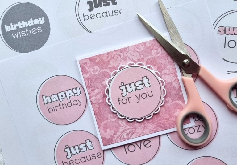
The Vault brings all of my printable sentiment sets together in one collection, so instead of having to search through separate sets every time you finish a card, you have lots of different styles ready to try.
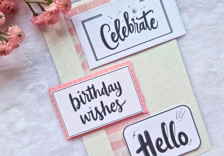
Solid color blocks, white-on-dark designs, soft scripts, simple boxed sentiments, circular sentiments, coloring sentiments and print-and-transfer sets — plus sentiments for birthdays, thank you cards, new baby, Christmas and everyday cards. And the collection keeps growing. Every new sentiment set I add is included for everyone who already owns the Vault, so you don't have to buy the same collection again.
If you would rather try card making printables before getting the full collection, you'll also find free ones on my Freebies page.


A Few Simple Card Making Tricks That Help
There are a few little things I do when I'm unsure whether a sentiment is working.
Squint at your card. It sounds silly, but it works. When you squint, the small details disappear and you can see the overall balance more easily. If the sentiment disappears into the background, you probably need more contrast.
Cutting straight without a trimmer. Cut one confident pass rather than lots of small snips. Small snips are what make edges look wobbly.
Take a photo before you glue. I do this surprisingly often. Put everything on the card, take a quick photo with your phone, and look at the photo instead of the actual card. A photograph flattens things slightly, and sometimes a problem that you didn't notice in real life suddenly becomes obvious.
Try several options before deciding. This is probably the most useful one. Don't assume the first sentiment that fits the occasion is automatically the best one for the card.
Gluing straight. Put a tiny dot of glue in the middle of the sentiment only, position it, check it, and then glue the corners. You get one chance to nudge it before it sets. If you're using a foam tape to get a 3D look, position the sentiment using tweezers.
Give the sentiment some breathing room. If it's sitting directly on a very detailed pattern, try adding a plain panel underneath it. Even a simple rectangle of cardstock can make a huge difference.
Don't be afraid to use a decorative font. If you love a particular script, try it. A busy background doesn't automatically mean that your sentiment needs to be plain. Give it a solid background and see what happens.
Print on the right paper. Card stock of at least 175 gsm (65 lb) keeps the sentiment sturdy. If your printer cannot handle thick paper, print on plain copy paper and glue the sentiment to a scrap of card stock afterwards — nobody will ever know. More on that in Card Making Printables for Beginners: A Practical Guide to Printing at Home.


You Don't Need Special Tools to Make the Sentiment Work
The decorative edges on these cards came from dies and punches, and I love those little details. But they aren't what makes the sentiments work. If you cover up the scalloped edges and the punched border, the important part of the design is still there: contrast, breathing room and a sentiment that feels connected to the rest of the card.
So if you don't have a die-cutting machine or a collection of punches, don't let that stop you. A simple rectangle can replace a decorative panel. Scissors can replace a fancy die. And a printable sentiment can give you beautiful lettering without needing stamps, alphabet dies or ink.
That's one of the things I like most about printable sentiments: they make it easy to experiment. You can print another one. And another. And another. You don't have to commit to the first one you cut.
One Last Thing
I think the biggest lesson from these three cards is that you don't have to find the perfect sentiment straight away.
Try a few. Move them around. Change the color. Add a plain panel. Take a photo. Look at the card from a little distance. And if the sentiment still doesn't feel right, don't assume you've chosen the wrong words. Sometimes it just needs a better place to sit.
Good contrast + a little breathing room can make almost any sentiment work.
And once you start looking for those two things, choosing a sentiment becomes much easier — and, at least for me, a lot more fun.
Happy crafting!